The Blue Light Blindness: Why Your Audio Gear Shouldn't Double as a Spotlight
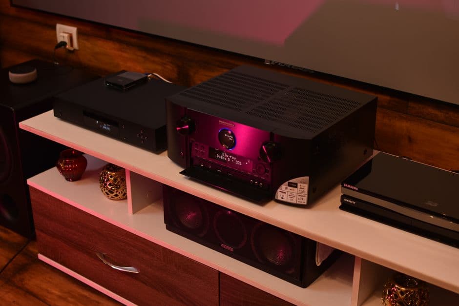
Stop treating your living room like an airport runway. I break down why some gear respects your eyes—and why others require a roll of electrical tape to be usable.
I spent a decade hauling heavy amplifiers into dark, cramped clubs, and the last thing I ever wanted to see in those rooms was an unnecessary light show. You’re there to listen, to feel the bleed of the room, and to focus on the performance. Yet, when I sit down at home to enjoy a record, I’m often greeted by a status LED so aggressively bright it feels like a physical assault on my retinas.
We have somehow collectively agreed that if a piece of gear is powered on, it must announce that fact with the intensity of a lighthouse beacon. It’s a design trend that treats home audio equipment like critical aviation infrastructure, and it’s ruining the atmosphere.
The Science of Unwanted Illumination
This isn't just a grumpy musician’s preference for low-light ambiance. There is a physiological reason why that piercing blue indicator feels so jarring. Research into light pollution notes that blue-light-emitting diodes have a high intensity and a short wavelength that our eyes are particularly sensitive to, especially in a darkened environment.
When you are trying to lean into a quiet passage of a jazz record, you don't need a concentrated beam of high-intensity light burning a hole in your peripheral vision. It forces your pupils to constrict, actively working against the relaxation you’re trying to achieve by putting on music in the first place. When manufacturers opt for the brightest, cheapest diode they can source, they aren't improving the user experience; they are creating a visual distraction that fundamentally clashes with the purpose of a listening room.
The Good, The Bad, and The Blinding
To understand how this plays out in the wild, look at the contrast between two common desktop staples: the Schiit Modius and the Topping DX3 Pro+.
I’ve had both on my desk, and the difference is night and day—literally. The Schiit Modius uses a subtle, diffused white light that tells you what you need to know without screaming it at you. It’s an exercise in restraint; it respects the fact that the gear is sitting in your line of sight. It’s a design choice that says, "I am here, I am working, now go back to your music."
Contrast that with the Topping DX3 Pro+. Topping makes some undeniably great-sounding hardware for the price, but their implementation of status displays often feels like a neon sign in a library. That high-contrast, ultra-bright screen and indicator array turns a darkened room into a cockpit. If you’re using it as a near-field DAC while working or relaxing, it’s a constant, flickering nag.
And don’t even get me started on budget Bluetooth amps. Many of these units—frequently white-labeled gear found on marketplaces like Amazon—use LEDs that are essentially unfiltered surface-mount diodes. They aren't behind a lens; they are just raw, angry light. If I have to reach for a piece of black electrical tape to make a unit usable in the evening, the industrial design has failed. It’s not a "quirk"; it’s a lack of fundamental consideration for the end-user.
Function Over Frills
In my years of reviewing gear, I’ve found that the best equipment knows when to get out of the way. There are engineers who seem to understand that a status light should be exactly that: an indicator, not a floodlight.
Some of the most thoughtfully designed equipment I’ve tested allows for "dim" or "off" modes for these indicators. It’s a simple feature, yet it’s surprisingly rare. It implies a level of respect for the user—a recognition that the gear exists to serve the music, not to advertise its own power state to the entire neighborhood. If you are a manufacturer, putting a dimming function in your firmware or a physical toggle on the chassis is a low-cost, high-value win that instantly sets you apart from the "blinding" crowd.
The Aesthetic of the Runway
There is an ongoing disconnect between the marketing of "lifestyle" audio and the reality of how these products live in our homes. We are sold products that promise to harmonize with our interior design, yet these same devices arrive with blinding light arrays that would look more at home on a commercial runway.
It’s tempting to call this a minor quibble, but when you spend your hard-earned money on a piece of equipment, you are paying for the entire experience. If the gear dominates the room with unwanted light, it’s not just a minor annoyance; it’s a design flaw that limits the product’s utility.
We need to stop accepting "bright" as the default setting. The best audio gear is gear you can listen to with your eyes closed, or in a room where the only thing demanding your attention is the soundstage. If your amplifier is brighter than your reading lamp, something has gone fundamentally wrong in the development process.
Manufacturers, take note: nobody is looking at the power light to decide if the music sounds good. Give us a dimmer switch, or better yet, a light that glows with the subtle, warm intent of a pilot light rather than the harsh, cold glare of a laser. My living room is for listening, not for conducting landing procedures. Keep the spotlight for the stage, and leave my peripheral vision out of it.